Overview
Purpose
The purpose of the site is to share quick, easy meal plans and recipes. It is also to provide the user with the information necessary to successfuly execute the meal plans
Audience
Someone fairly new to cooking as the recipes and techniques will be simple and probably not prepared in the right way according to a chef. The user would not be looking for fancy, gourmet recipes just something to get the job done without spending a lot of time, money or effort on it. A typical user would be a male. 20’s to 40’s or perhaps an older gentleman who has been widowed and now needs to fend for himself in the kitchen. Other users could be single parent who don't have much time or anyone who needs a quick, easy meal idea.
Branding
Website Logo
Style Guide
Color Palette
Palette URL: https://coolors.co/01233f-3a3a3a-9f0707-f2f2f2
| Primary | Secondary | Accent 1 | Accent 2 |
|---|---|---|---|
| [#01233f] | [#3a3a3a] | [9f0707] | [f2f2f2] |
Typography
Heading Font: Black Ops One
It is the same font that was used in the icon to give the website consistency. Square corners and bold weight make it good for headings and give it masculine character which aligns well with the target audience
Subheading Font: Goldman
This type of font is often associated with science fiction, action, thriller, and sport genres. It goes well with Black Ops One, but has lighter weight lines for readability. It is consistent with the masculine theme of the website.
Paragraph font: Open Sans
Normal paragraph example
We offer easy meal plans that don't require very much time to prepare. Less time planning and cooking means more time eating and enjoying!
Colored paragraph example
So you don't know basic cooking skills? No problem! Manly Meal Plans has a section dedicated to teaching you the basic skills you'll need to execute our recipes.
Navigation
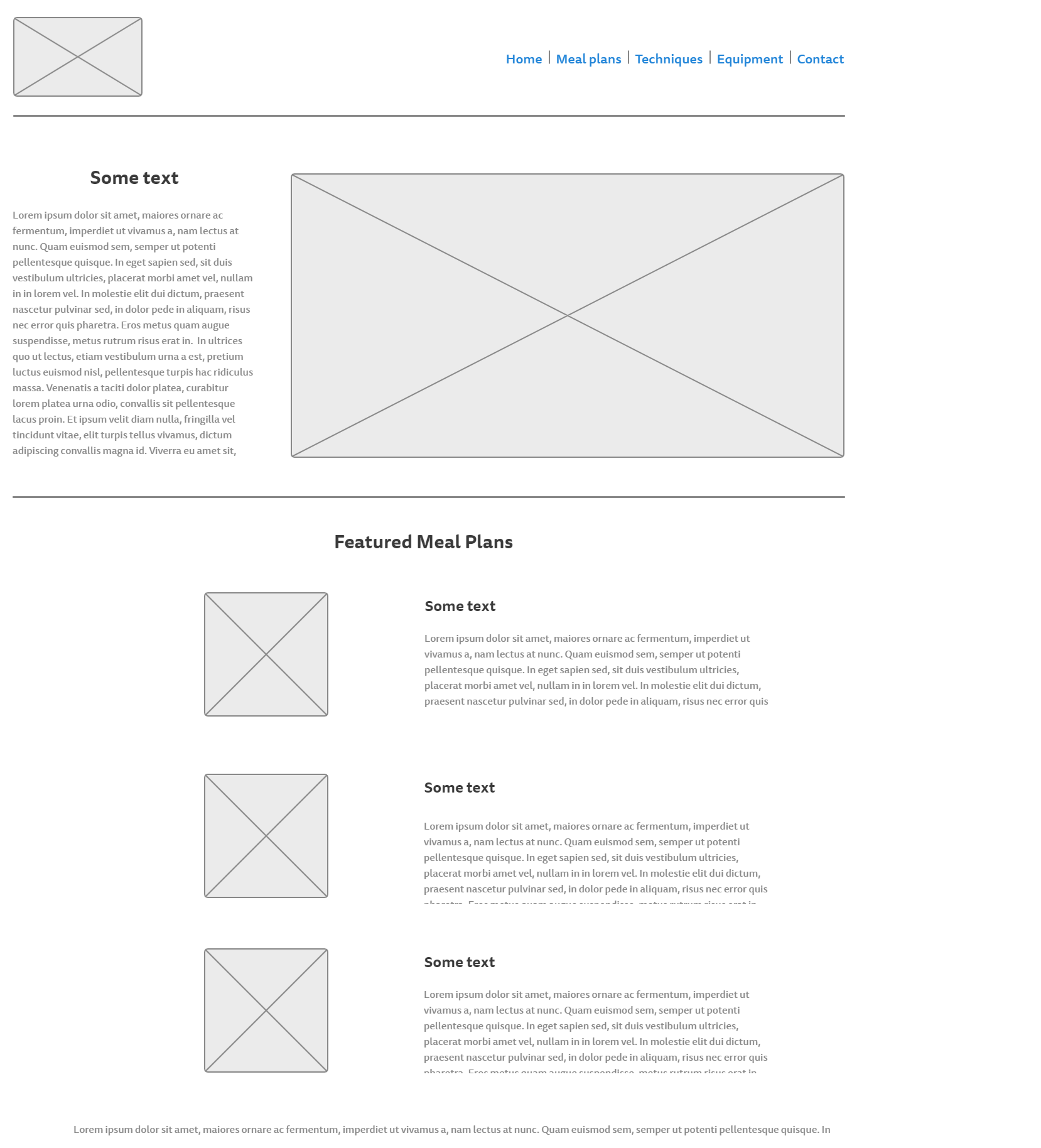
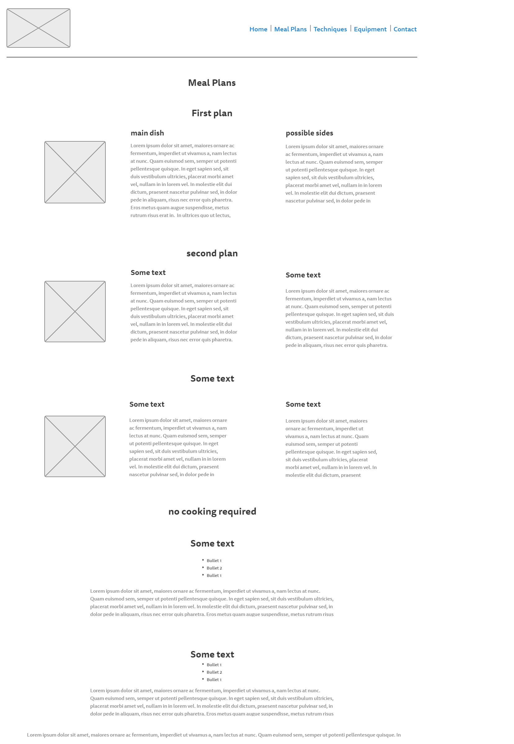
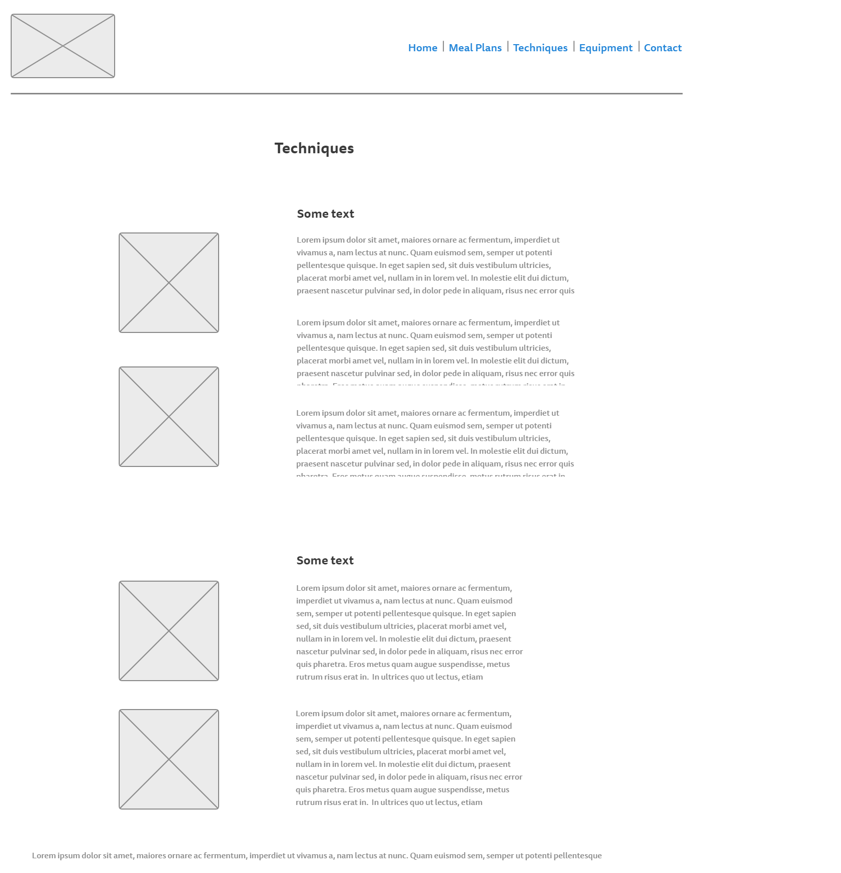
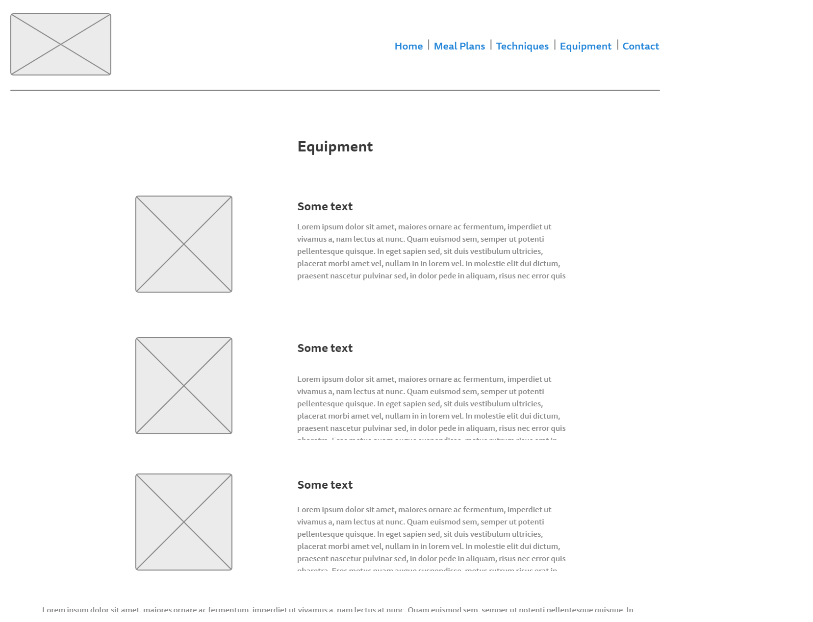
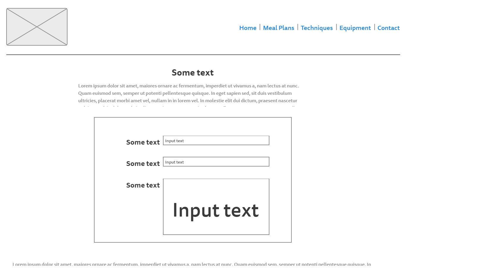
Wireframes
